I discovered a fun little app the other day.
The Sherwin-Williams Paint Visualizer.
A perfect tool to help me distract myself from writing deadlines and laundry and the crazy heat outside.

This is what our house looked like when we bought it. My favorite thing is the deck off to the side. It is the best feature of the exterior. The second best feature is the front porch which has siding on the walls, ceiling, and on the overhang trim. Of course you can’t really see the porch because of the overgrown bushes, but in time those will all come out and wewill build wide steps leading down to the lawn. It will be lovely. Someday. #SlowHome, remember?
If you are suprised that this is what the exterior of my house looks like, you are not alone. I am too.
This style of home is not the kind I would have picked out of a magazine. It is no secret that I am more of a farmhouse and cottage kind of gal, but still, I fell in love with this funny mid-century house and its adorable Fisher-Price-esque deck. In fact that is how I describe the house – it looks like something Fisher-Price would have made. And I am a huge Fisher-Price fan.
But still, despite the deck and the front porch, the exterior needs some spunk.
Which is where the Paint Visualizer comes in handy.
Before I got started I did some digging on Pinterest for inspiration. What would look good with red brick, but still be fun and colorful? So I searched
“red brick painted siding.”
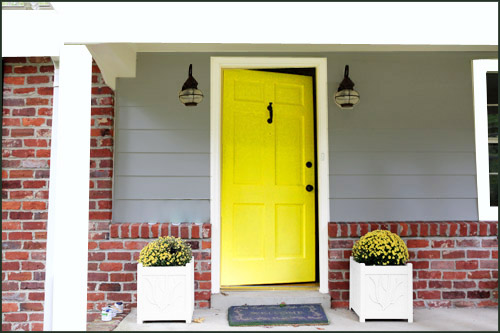
The first image that really grabbed my attention was this one from Young House Love. I love the contrast of the gray and the brick and the happy yellow along with all the white trim.
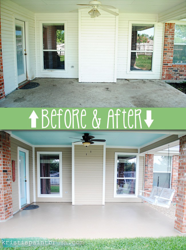
This was the second image I found (from I Should Be Mopping The Floor) that I saved. Not so much for the color section, but for the difference it made for the space to even have a little color. The all white in the Before pic is lovely for a cottage or traditional farmhouse look, but maybe not the way to go for a Fisher-Price house.
Also I loved the painted ceiling (haint blue of course) and the painted concrete floor. Two additional things I plan to do on our porch as well.

After I found my inspiration pics, I headed over to the Paint Visualizer and began to play. The first thing I did was change our roof color to green (which it actually is, the brown roof was what it was before we purchased the house.) I am not sure when or if we will ever change the brick color. That is a big job that I do not foresee being high on our priority list for at least a decade, so I just tried to enhance what we already have, leaving the brick color as-is.
Then I added thick white moldings around the windows (which Sweet Man will build a lot better than I drew with my mouse…) painted the siding and choose a door color. First I went with yellow.

Then red (a nod to our cottage in town.)

Here it is with gray siding and a blue door. Slightly more tame than the first two.
I have no idea which color combo I will go with in the end, but I do think it will be somewhere in the neighborhood of these three.
Painting the porch and the door is something I could do myself over the course of two weekends once the weather cools. Sweet Man will build the window trim eventually – maybe one winter when there isn’t as much to be done outdoors and the sun sets early (remember we are doing this all #SlowHome speed) – and I am hoping we can chop down the hedges this fall. In fact, I probably won’t paint until I get those hedges out-of-the-way and I really see what I am dealing with. Who knows what sort of inspiration might strike when I can actually SEE the front porch!
Until then I will keep playing with the visualizer app when I need a well-earned break from adulting.
Happy Weekend friends!


Love the yellow door.
That yellow is definitely eye-catching. I like it a lot!