I have been having some fun working on new logo’s for Storia di Vita Design and all my separate little branches of fun and folly… This is one of those things that you can spend hours and hours fiddlin with and changing. But for now I am liking the direction I am going…
Here is what I have so far…
This is to got at the top of letters I send that have to do with business-y stuff…
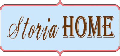
Here are my 2 shop names in similar, but not identical looks.
This is my more formal logo, to be used when I am presenting to more staid and less vintage clients (web design primarily)
And here is my favorite and the one I will use most often… At least until I change it all again!
Here is what I have so far…
This is to got at the top of letters I send that have to do with business-y stuff…
Here are my 2 shop names in similar, but not identical looks.
This is my more formal logo, to be used when I am presenting to more staid and less vintage clients (web design primarily)
And here is my favorite and the one I will use most often… At least until I change it all again!

I like them all, but especially the last one. I’m drawn to all those colors so strongly right now! Pink, blue and green in those shades are just so fresh and the brown looks great with it. Good job!< HREF="http://thevintagebutterfly.etsy.com" REL="nofollow">Kelly/The Vintage Butterfly Boutique<>
i love the bottom one so much but that’s the Delta Zeta coming out in me…and the heading FOLLY just rox the house!
oooh, I was thinking ~ that’s my favorite! and then I saw it was your favorite, too 🙂 I think it’s the stripes & florals; can’t go wrong with stripes & florals.